Mapping the Customer Lifecycle
Alaska Airlines' lifecycle marketing ecosystem had grown into a complex network of customer journeys, campaigns, and touchpoints.
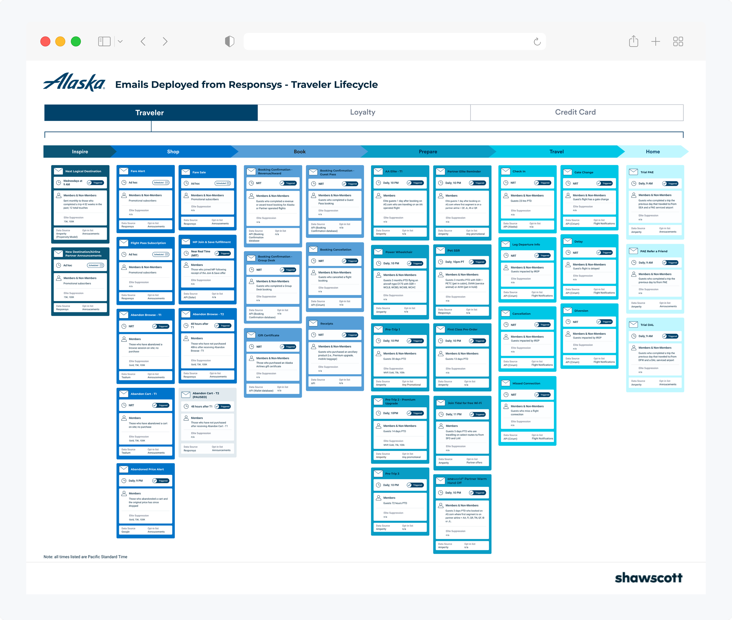
I designed a centralized, interactive visual map that helped lifecycle marketers quickly locate campaigns, understand where they fit within the customer lifecycle, and identify gaps across the customer experience.
My Role
Lead UX Designer with end-to-end design ownership of an internal interactive campaign mapping tool.
Translated complex marketing needs into a scalable, user-centered tool
Partnered with strategy teams to improve clarity and usability
Designed interface patterns to support consistent data exploration and use
Credits:
Created at: Shaw/Scott
Team: Aric Rist (Creative Director), Kim Brown (Strategist), Heather Manchee (Strategist)
The Problem
The Alaska Lifecycle Marketing team requested a tool to address a few different issues:
Training: New team members needed a visual reference for all email campaigns.
Interdepartmental Transparency: Other departments needed a self-serve resource to answer campaign-related questions.
Internal Reference: The marketing team needed a scalable tool to consolidate campaign data and lifecycle mapping.
Project Requirements
Fast Turnaround: The work needed to be completed and approved within a 2-month timeline.
Clear Data Representation: Display recipient count, launch time, audience segmentation, and campaign details.
Lifecycle Mapping: Each campaign needed to be assigned to a specific stage in the customer journey.
Scalability: Flexible design to accommodate additional data layers in the future.
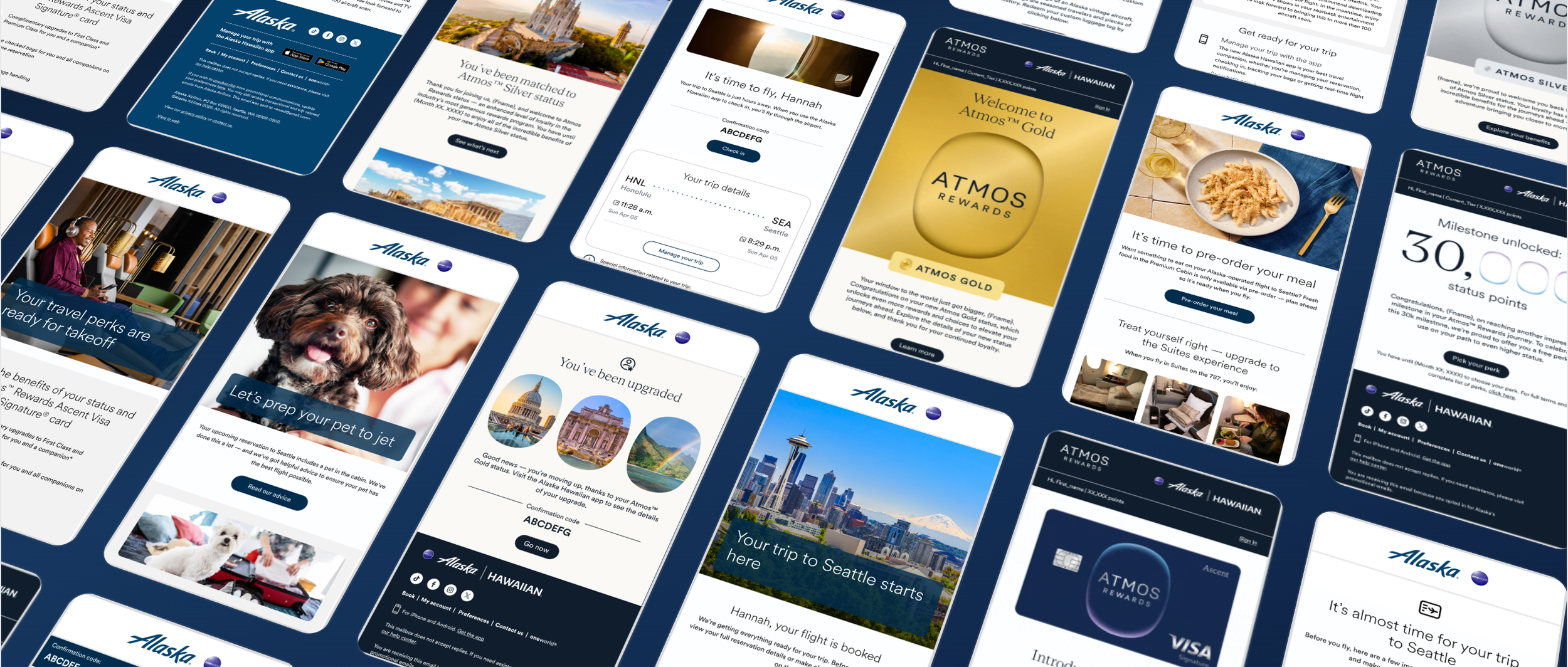
Approach
Initially, we considered reusing a previous journey map format, as it was familiar to the client. However, when testing it with project data, some key limitations were identified:
Labels outside campaign tiles resulted in inefficient use of space.
The layout required 10-15 pages, making navigation cumbersome.
The previous layout was also built based on a static artifact model which needed to be updated manually and could not capture program changes in real-time.
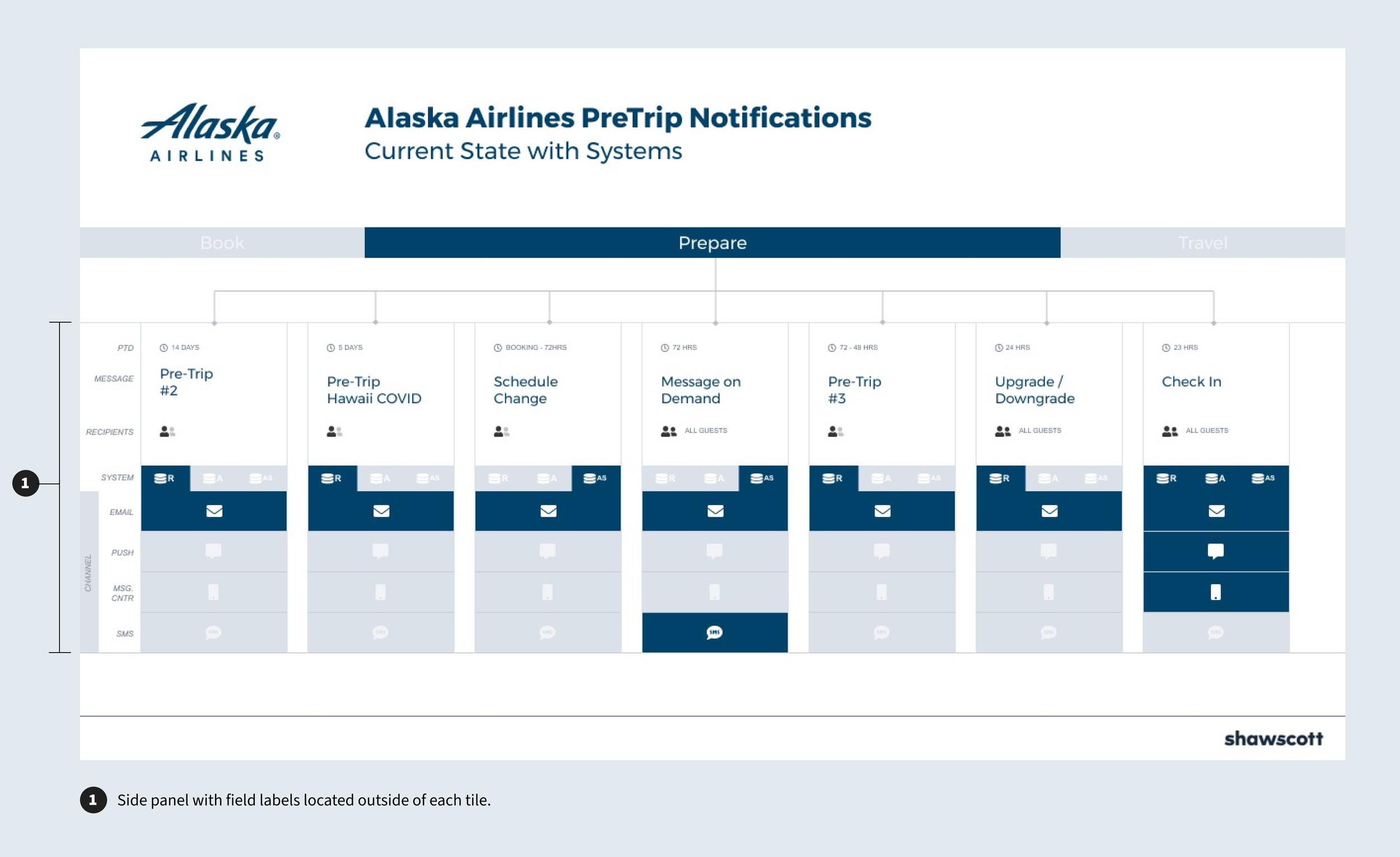
Previous Journey Map Format
New Information Architecture
We explored alternative solutions and realized that an interactive dashboard—rather than a static journey map—would better serve Alaska’s needs.
By dedicating a page to each lifecycle stage instead of each phase, we significantly reduced clutter and improved usability.
Card Structure
Through collaboration with the Shaw/Scott Strategy team, we were able to reduce the number of campaign details to a digestible amount, ensuring users were getting enough information without being overwhelmed.
For quick scanning, we introduced a card-based structure:
Each campaign card displayed key details in a compact, easy-to-read format.
Color-coded backgrounds aligned with lifecycle phases, making it easy to understand campaign positioning at a glance.
Outcome
The final deliverable was a Figma prototype with three top-level pages, each mapped to a stage of the customer lifecycle. The Alaska Lifecycle Marketing team was thrilled with the result and continues to use it as a reference for campaign planning.
Its success led to additional work: a few months later, Alaska re-engaged our team to expand the prototype with campaign-level data and journey mapping. We added hover states to key components, linking out to new “Campaign Details” pages. What began as a static reference grew into a dynamic, interactive tool—extending the value of our original design.
“This has exceeded all of my expectations. I have never seen anything like this in my career. My heart is singing!'
-Lori Ho, Director of Growth and Lifecycle Marketing - Alaska Airlines