Email Design System for Rover
Rover partnered with Shaw/Scott to develop a scalable and cohesive email design system that would streamline workflows, ensure brand consistency, and improve efficiency across their marketing communications.
I spearheaded the creation of this system in Figma, establishing a structured approach that would empower Rover’s team to create high-quality, on-brand emails with ease.
My Role
Sole Designer — Design System Architecture & Implementation
Architected the end-to-end email design system, including structure, taxonomy, and governance
Defined component hierarchy, layout rules, and semantic naming conventions
Designed and documented all modules and patterns
Established usage guidelines to support scalability and consistency
Credits:
Created at: Shaw/Scott
Team: Vinca Swanson (Developer), Aric Rist (Creative Director), Em Wooden (Copywriter)
The Problem
Too manual: Rover’s email campaign process was inefficient due to manual campaign builds and frequent customization
Additional support: Rover’s creative team needed support to meet marketing goals, like increasing dynamic content and scaling up campaign volume
Problems with dark mode: Rendering results in dark mode were often buggy - the team wanted to get a better upfront understanding of how different colors, modules, and elements would render before building out designs.
Project Requirements
The whole system needed to be built and handed off to Rover 3 months from kickoff
The system needed to include a set of 33 modules outlined by Rover
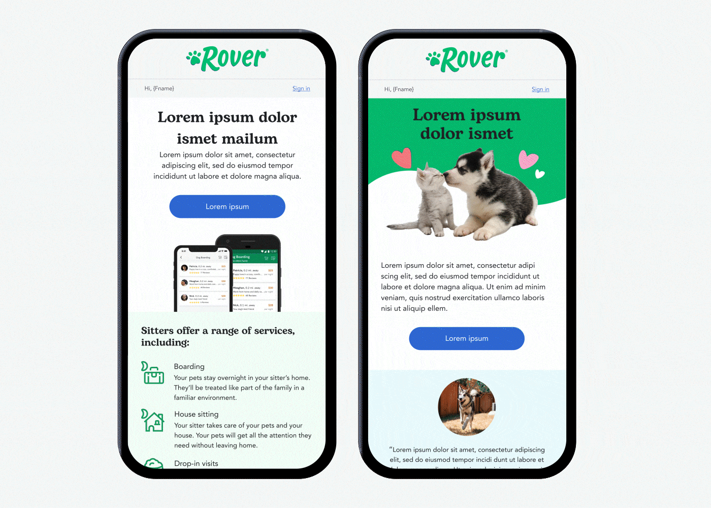
All assets and modules needed to be fully responsive and render well in both light and dark mode
The system needed to include a consolidated image/asset library
The system needed to be built in Figma
Execution
We applied what we learned in our initial discovery sessions to establish a structure for the design system, referencing formats used in systems like Google Material design and guidance in “Laying the Foundations” by Andrew Cauldwell. Based on Rover’s needs and the problems we were trying to solve, we proposed a design system with four core sections: (I) Foundations, (II) Modules, (III) Image Library, (IV) Guidebook.
I. Foundations
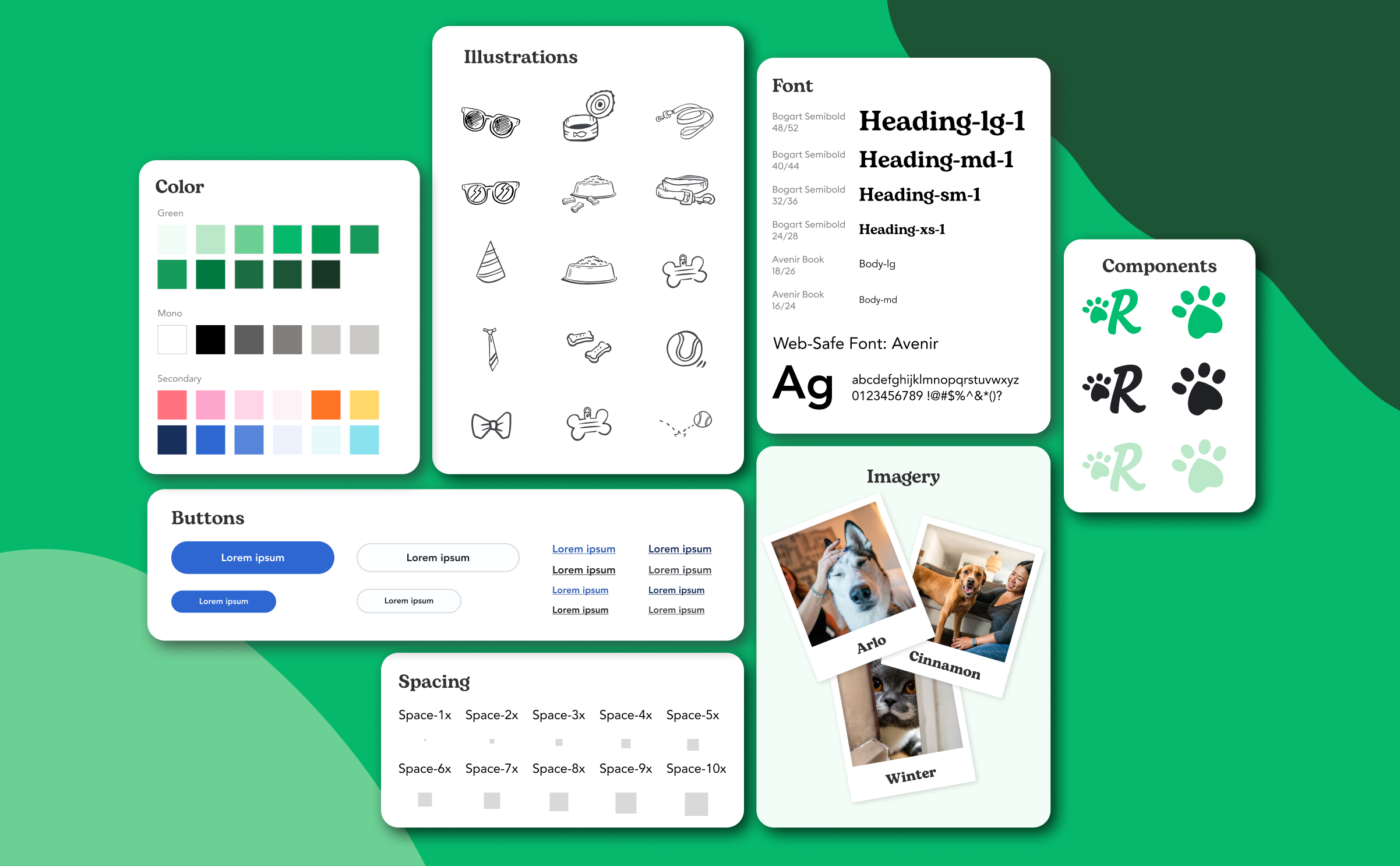
The foundations of the Rover Email Design System provide the framework for all supporting building blocks. These pillars establish rules for color usage, typography, and spacing systems.
I. FOUNDATIONS
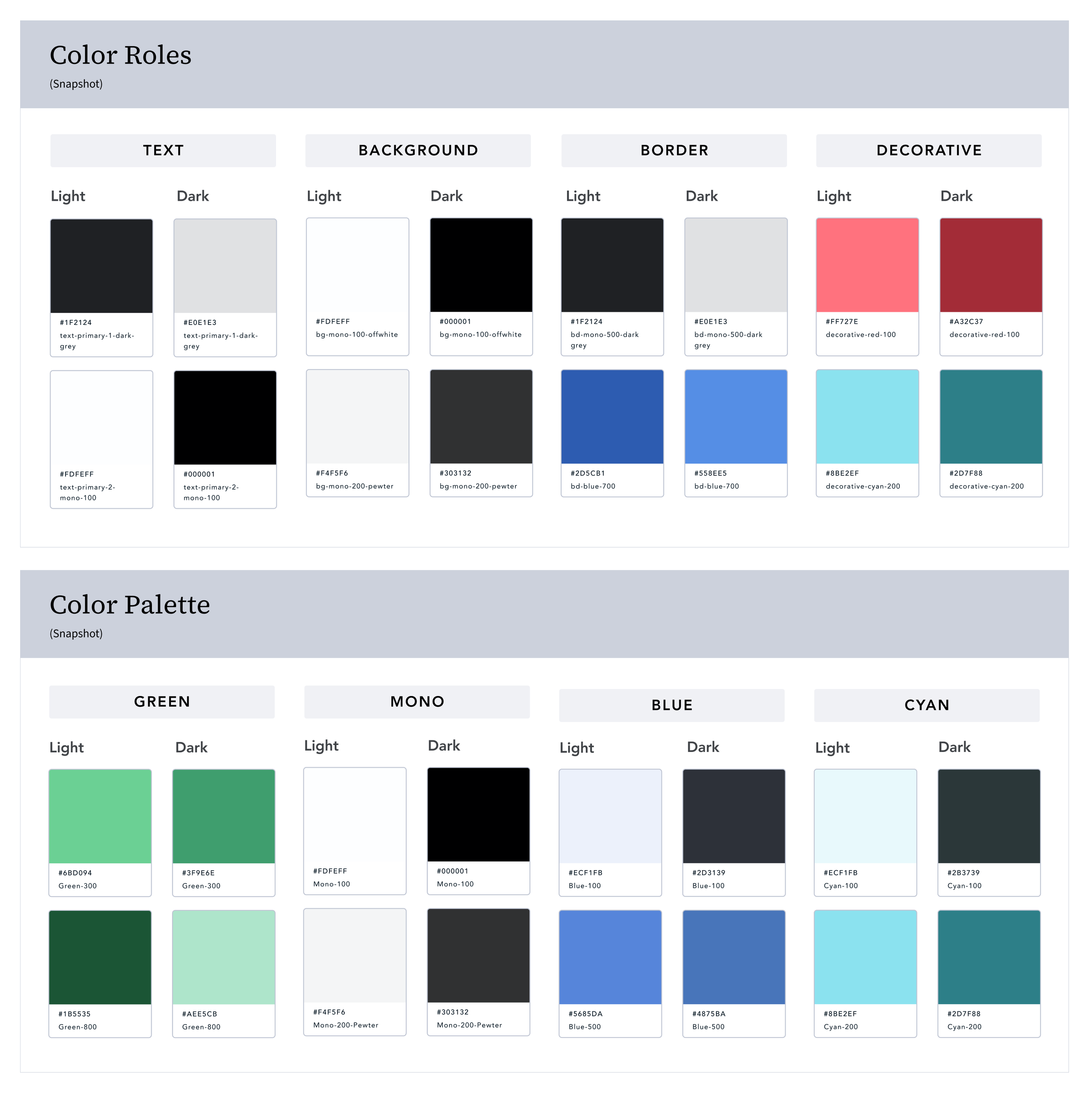
Color Tokens
We used the dark mode testing results and guidance included in Rover’s brand guidelines to inform the roles we assigned to each color within the system. Applying CSS naming conventions and kebab-case, we included indications of color roles in our semantic token structure names. For example, colors used for borders were indicated with the abbreviation “bd” at the beginning of each token and colors reserved for "background” started with the letters “bg.”
I. FOUNDATIONS
Typography
Our type system used T-shirt sizing to reference font sizes with values ranging from large to extra small. Email clients tend to have little support for custom brand fonts, so we set up each component to include both a custom font (Bogart) and a system font (Avenir) headline option.

I. FOUNDATIONS
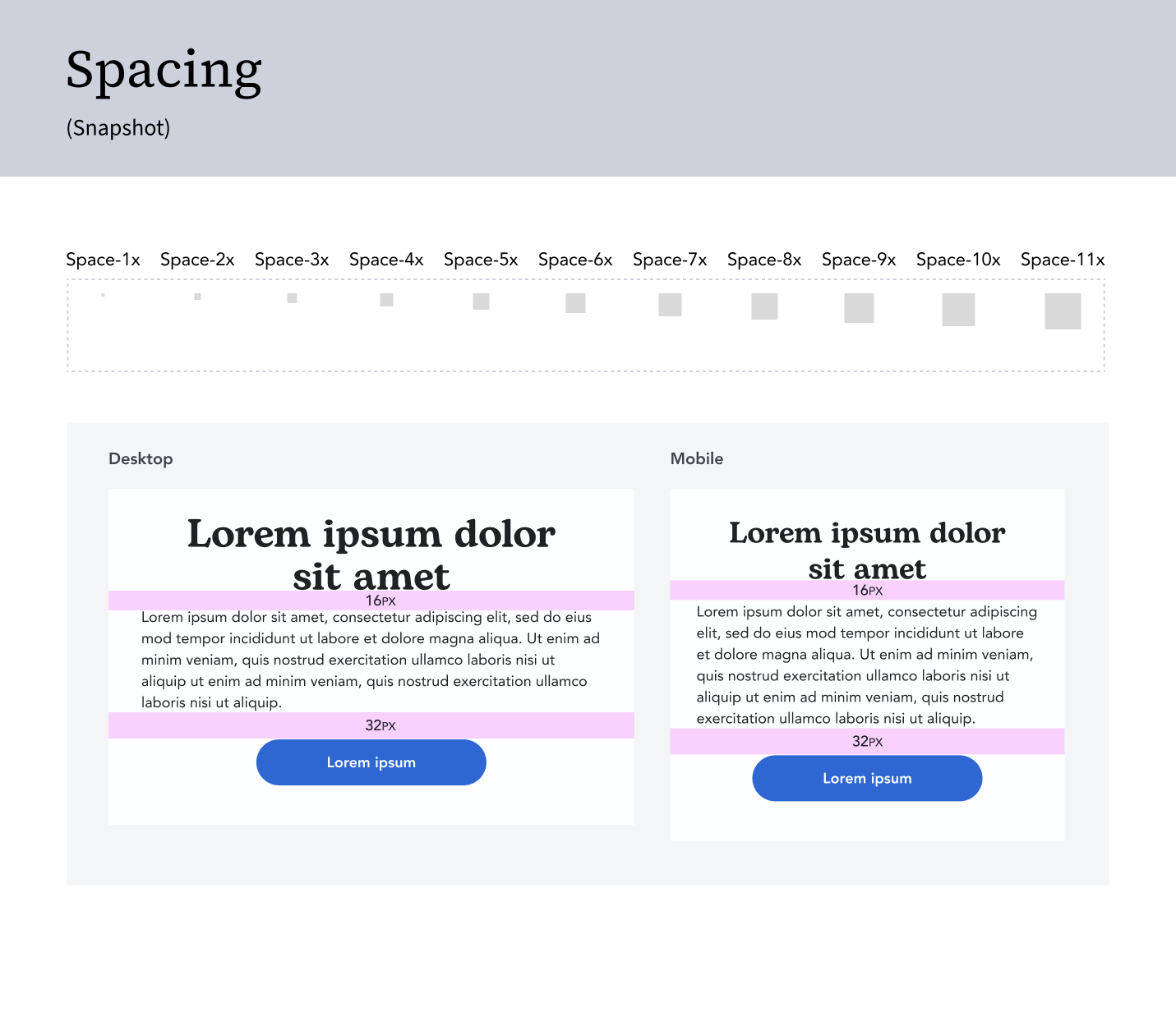
Spacing
Intentional spacing and alignment were key considerations in Rover’s design system, which led us to adopt a 4pt grid over the more common 8pt. This gave us finer control over layout, ensuring the system could flex to meet Rover’s specific needs.
To align with the Rover Product Team, we used a value multiplier spacing system with a base unit of 4px. Each spacing unit was calculated with the variable X equal to 4. So, the first spacing increment was called “Space-1x (4px),” followed by “Space-2x (8px),” and so on.
In addition to the grid system, we established spacing rules for elements within modules to ensure consistency. For example, in primaries, we always used 16 pixels between headlines and body copy, and 32 pixels between body copy and CTAs.
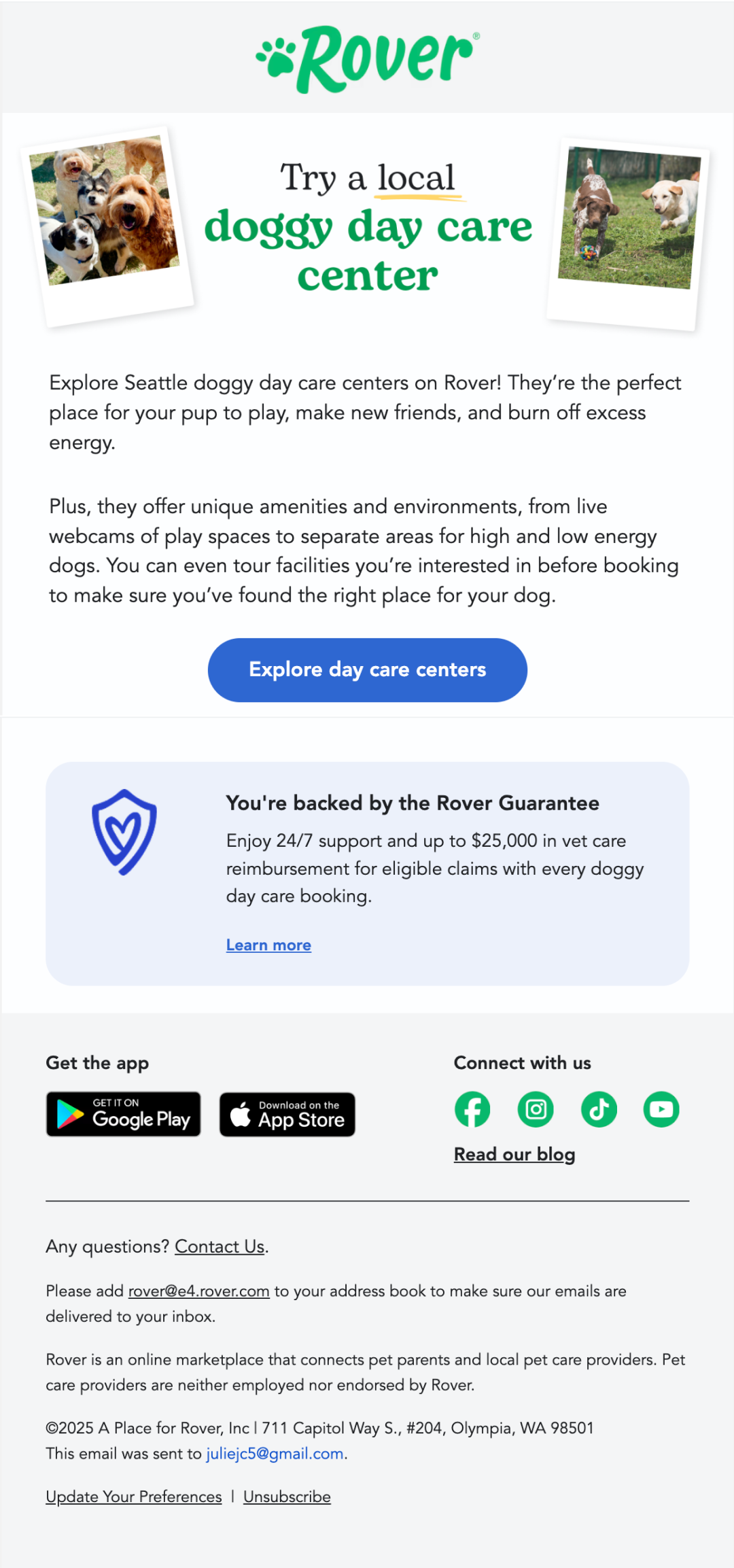
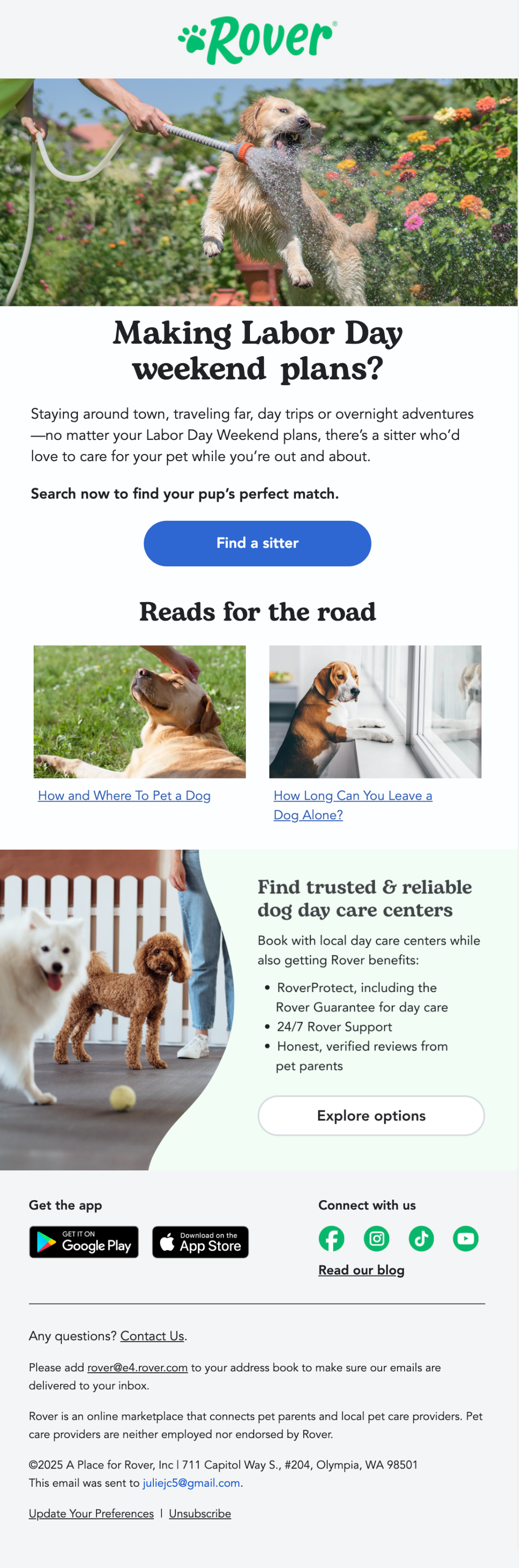
II. Modules
At kickoff, Rover asked us to include about 30 existing modules in the system. To keep the work manageable, we split them into batches of 10 and moved through three rounds of creative review with their team.
Early on, we faced a decision about how to classify modules. Many email design systems organize by layout (1-column, 2-column, 3-column). Instead, we chose to group modules by hierarchy, mirroring how Rover had already been using them in layout. This helped maintain consistency and made the purpose of each module clearer in future builds.
Learnings
One of our biggest learnings came during this stage. The initial scope hadn’t defined how many modules we’d create—or that each set would go through three full review cycles. On top of that, we ended up producing more variants per module than expected. These scope gaps stretched the delivery timeline, but also clarified the importance of defining review expectations and variant limits upfront.

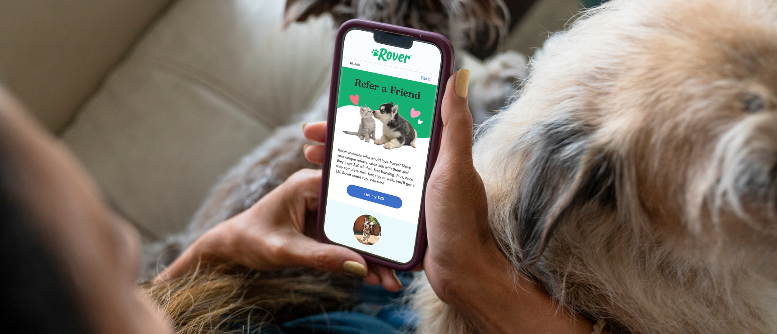
III. Image Library
In our initial discovery sessions, Rover shared that they needed access to a set of brand-approved images in the Email Design System.
At the time, there was no external DAM that we could link to with a Figma plugin so we decided to integrate brand-approved images into the Figma Library itself, on their own dedicated page.
We separated each set of imagery into country-based categories and created one component for each category so that different images could be selected as variants.

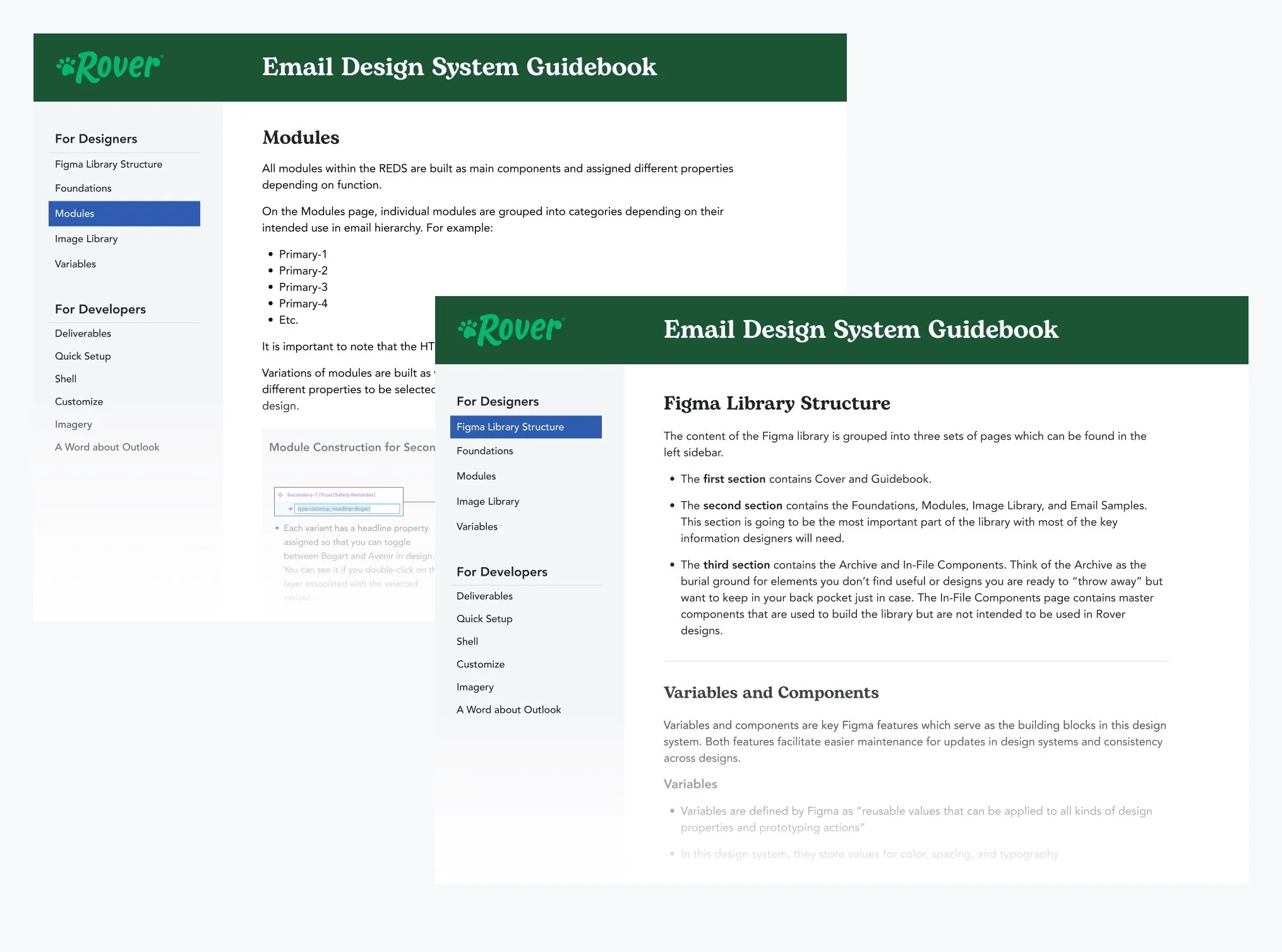
IV. Guidebook (and training)
After we completed design and code for the Email Design System, we created a comprehensive guidebook explaining the system architecture and contents for the Rover team.
We built the guidebook into the design system as an interactive prototype. This allowed the Rover team to access it quickly and make edits as necessary.
After handing off the system, we also conducted two trainings with the Rover team to answer any questions regarding functionality and structure - one training geared toward developers and one training for the Rover design team.
Outcome
Despite additional review rounds, the system was successfully delivered within four months, establishing stronger brand consistency, improving efficiency in email production, and laying a scalable foundation for future growth. This balance of speed and structure also positioned Rover’s creative team to work more confidently and independently, with a system designed to evolve alongside future brand and marketing initiatives.